Trying Out Radium With React Storybook
Radium is a set of tools that allow you to manage inline styles on React components. In this post I will go through the process of creating a React component using the Radium set of tools.
Before I continue, I should note that I have always been skeptical about inline styling in React. In the spirit of “don’t knock it until you try it”, I have decided to give inline styling a try!
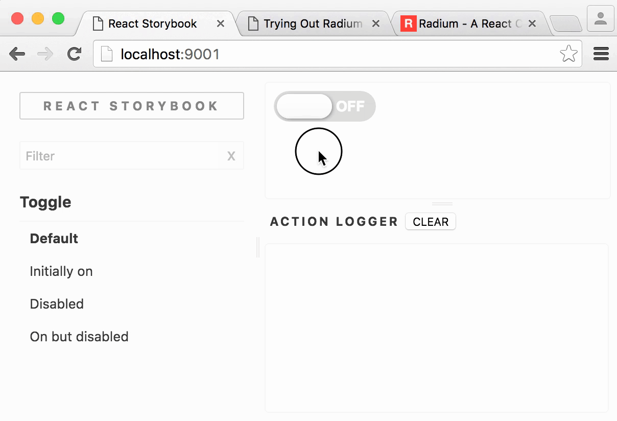
Here is a sneak peek of the end result.
React Storybook
To see my component in action, I will use the new React Storybook. React Storybook allows me to view and interact with a React component in an isolated environment.
The component I will be creating today will be a simple “on-off” toggle.
First I initialize a blank NPM based project. I then install React Storybook.
# initialize npm
npm init

# install radium
npm install --save-dev radium

# install react
npm install --save-dev react react-dom

# install react-storybook
npm install --save-dev @kadira/storybook
I want to make it easy to start the React Storybook tool, so I make the following change in my package.json.
{
  "scripts": {
    "storybook": "start-storybook -p 9001"
  }
}
Before I can start the tool, I will need to configure it. To configure React Storybook, I begin by creating a directory .storybook in the root of my project. Inside that I create
the following file and name it config.js. Later I’ll discuss what configuration goes into this file, but for now, these are its contents:
import { configure } from '@kadira/storybook';
function loadStories() {
// in here we will load
// storybook stories
}
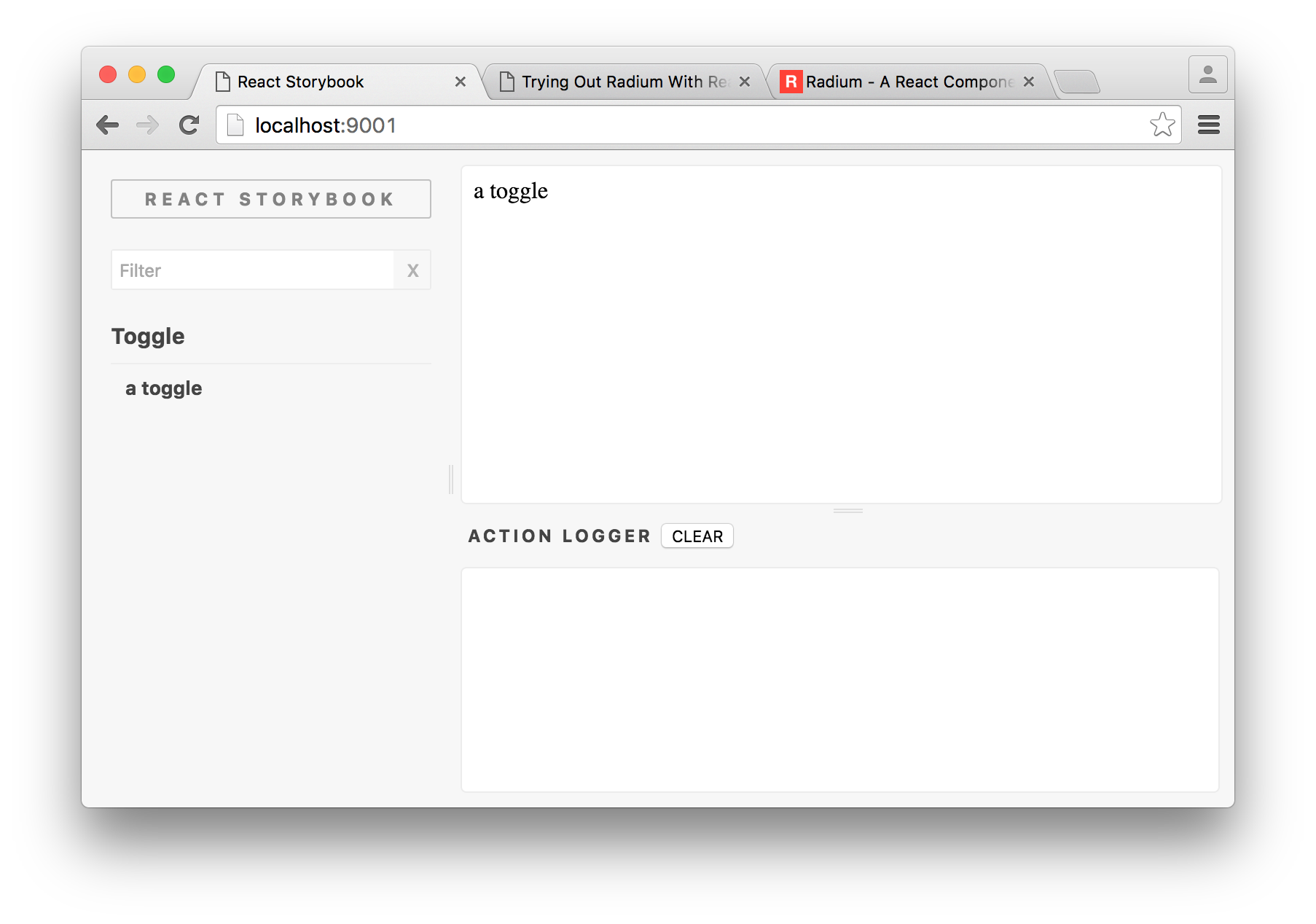
configure(loadStories, module);Now I can simply run npm run storybook to see my storybook. One problem, though, it’s empty!
React Storybook mounts React components through “stories”. A story is how I describe the various ways my component can be mounted. In one story I can have it mounted with one set of props and in another story a completely different set of props.
Before creating my first story I begin by creating my component. So I create a file named Toggle.js at the root of my project with the following contents:
import React from 'react';

class Toggle extends React.Component {
  render() {
    return <div>a toggle</div>;
  }
}

export default Toggle;
Clearly this component is not complete but it will act as a starting point. What I want to do next is create a story so that I can see it mounted in the storybook.
I create a file named stories.js also at the root of my project with the following contents:
import React from 'react';
import Toggle from './Toggle';
import { storiesOf, action } from '@kadira/storybook';

storiesOf('Toggle', module)
  .add('a toggle', () => (
    <Toggle />
  ))
By running my storybook tool I can now see that my component has been mounted. At this point, it should be noted that as I change the source code of the component, the mounted component will update live!
Radium
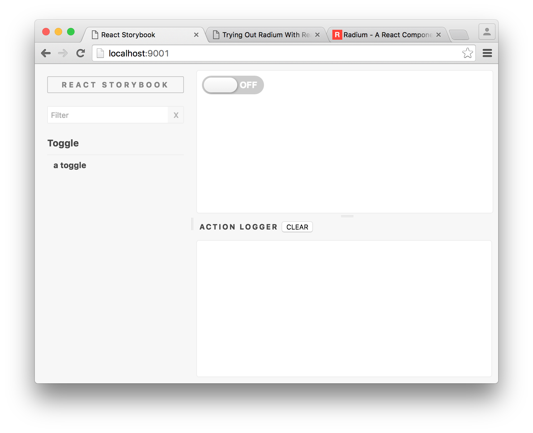
I take this opporunity to finally integrate radium. So I update my component as follows:
import React from 'react';
var Radium = require('radium');

@Radium
class Toggle extends React.Component {
  render() {
    return <div style={ {color: 'blue'} }>a toggle</div>;
  }
}

export default Toggle;
If your transpiler doesn’t support the @Radium decorator, you may wrap your class as follows:
import React from 'react';
var Radium = require('radium');

class Toggle extends React.Component {
  render() {
    return <div style={ {color: 'blue'} }>a toggle</div>;
  }
}

export default Radium(Toggle);
I’m finally left with a component that has blue text. However React does this already, so why would I need Radium?
Radium provides a number of added features for more complex styling. For example it allows me to style a component depending on different DOM states such as :hover and :active. Here is an example:
import React from 'react';
var Radium = require('radium');

var style = {':hover': { color: 'blue'}};

class Toggle extends React.Component {
  render() {
    return <div style={ style }>a toggle</div>;
  }
}

export default Radium(Toggle);
Radium also allows for the merging of styles, allowing us to modularise styles. The way in which it merges styles provides another useful feature; prop based and state based styling!
So if I want to style a component using any number of styles I can pass them to the component in an array. like so:
import React from 'react';
var Radium = require('radium');

var style = {':hover': { color: 'blue'}};
var mixin = { color: red };

class Toggle extends React.Component {
  render() {
    return <div style={ [style, mixin] }>a toggle</div>;
  }
}

export default Radium(Toggle);
If the array contains a value that’s not an object, such as a string or boolean value, then that value is ignored. This makes it easy to style a component based on some prop or state.
import React from 'react';
var Radium = require('radium');

var style = {':hover': { color: 'blue'}};
var mixin = { color: red };
var active = { background: 'red'};

class Toggle extends React.Component {
  render() {
    var modifier = this.props.active || active;
    return <div style={ [style, mixin, modifier] }>a toggle</div>;
  }
}

export default Radium(Toggle);
Examples aside it’s time to complete the toggle component using these features. I rewrite the markup of the component, define the various styles to give it that “toggle” look.
Here is the toggle, styled and looking very… “togglish”.
Finally, I need to think about how developers would want to use my component. So I need to think about what props and callbacks they might need to register.
In this simple toggle component, a developer would want to set the initial state of my component. The developer would also want to know when this state has been toggled. The developer may also want to disable the component entirely.
First I go ahead and implement that functionality in my component. Then it’s time to
update my stories.js:
import React from 'react';
import Toggle from './Toggle';
import { storiesOf, action } from '@kadira/storybook';

var createToggleCallback = state => action(state);

storiesOf('Toggle', module)
  .add('Default', () => (
    <Toggle onToggle={ createToggleCallback() } />
  ))
  .add('Initially on', () => (
    <Toggle onToggle={ createToggleCallback() } on />
  ))
  .add('Disabled', () => (
    <Toggle onToggle={ createToggleCallback() } disabled />
  ))
  .add('On but disabled', () => (
    <Toggle onToggle={ createToggleCallback() } on disabled />
  ))
Hope you had as much fun reading this as I did writing it. This is my first blog post and I would appreciate any feedback. You can post feedback on the issues page for this blog or just tweeting at me @benjaminkagia.
smile.